The process for updating the visual identity began with the creation of HubSpot’s new brand positioning. The Brand Marketing and Creative Teams partnered up to define our positioning in the larger market, and how we could best differentiate ourselves amongst competitors like Salesforce. The results were clear: the market was dull, sterile, and prioritized numbers over people. Disconnected CRM solutions made business software impersonal, and a drag to use. HubSpot shines brighter than our competitors as a vibrant, joyful, human-centered alternative. This ultimately became our north star:
In a sterile sea of blue CRMs, HubSpot is a vibrant and human brand.
Results & Impact:
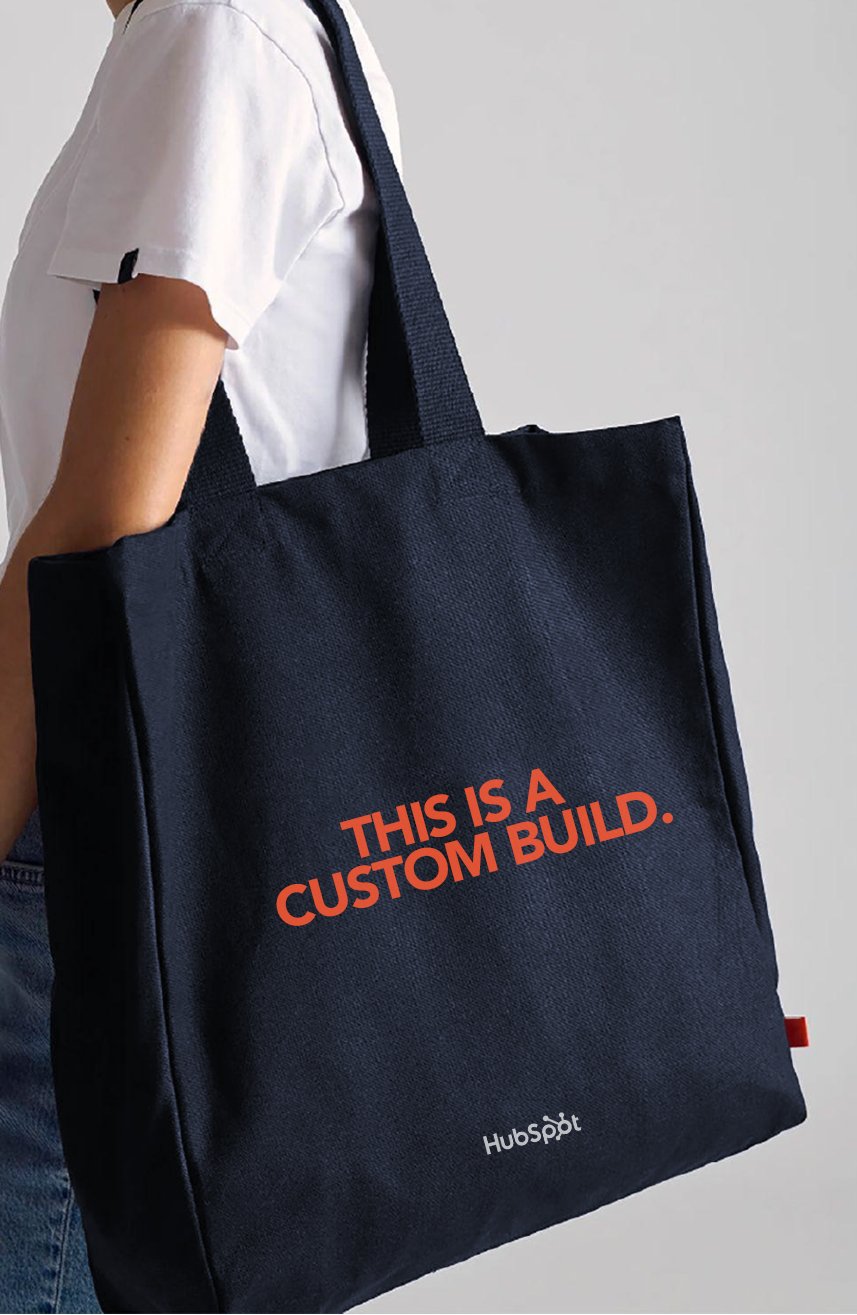
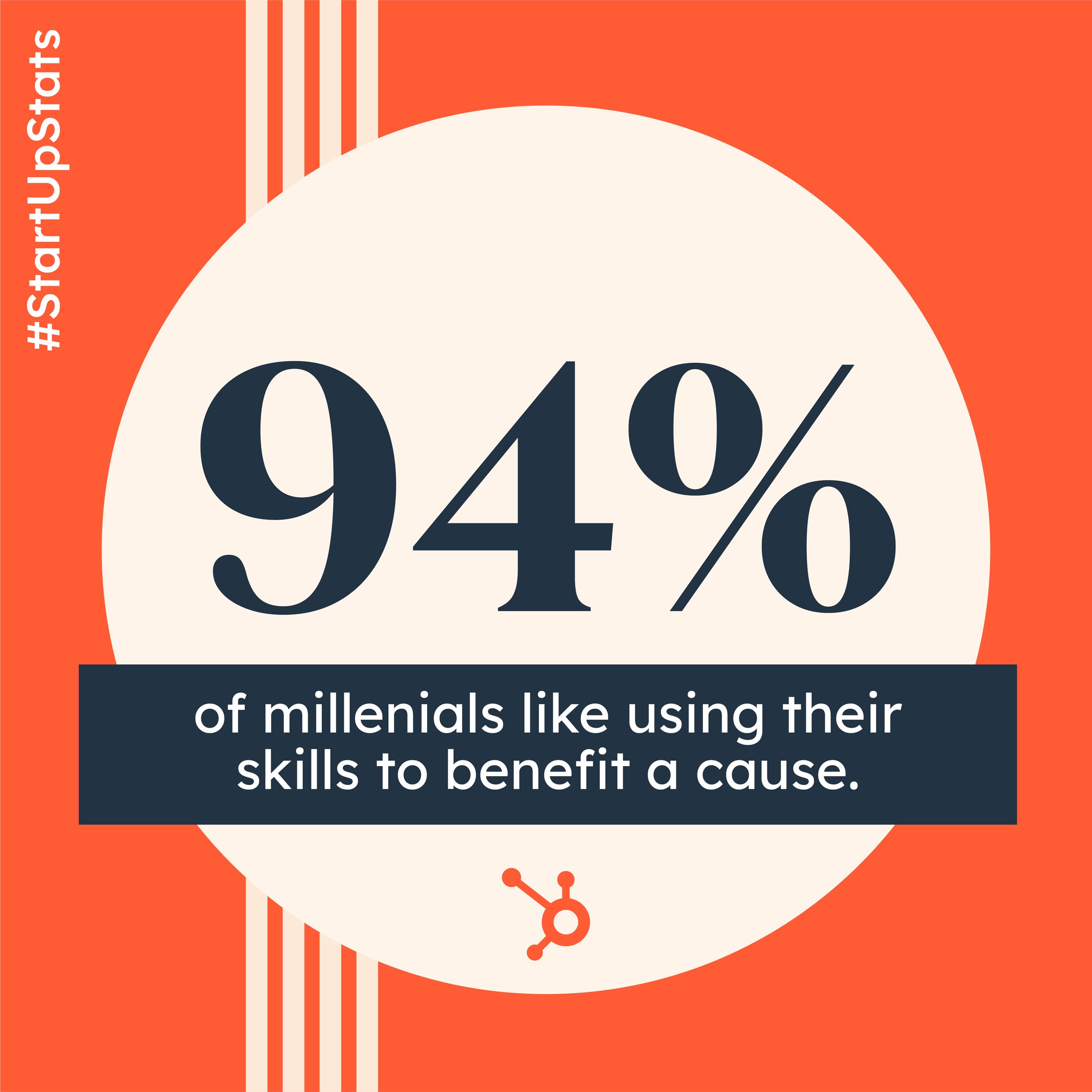
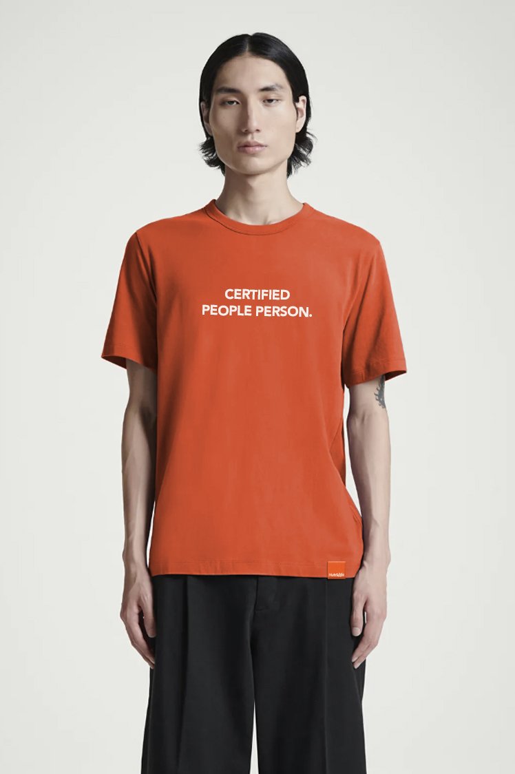
1,500+ brand assets redesigned across marketing, product, events, and sales
30+ global teams adopted the new visual identity
Under 6 month turnaround time from inception to company rollout
Supported the company's continued growth to 200,000+ customers worldwide
Earned coverage in Adweek, Fast Company, The Boston Globe, and Marketing Brew

Governance & Enablement
A brand is only as successful as its adoption. To ensure the new identity could scale across 7,000+ employees operating in 120+ countries, we built the systems that enabled teams to create confidently while maintaining a consistent brand experience.
The rollout included 700+ Canva templates, a fully redesigned Google Slides presentation system, dozens of Figma libraries for the creative team, 250+ modular website components, an animation library with 100+ reusable motion templates, and centralized photography and video libraries. Rather than treating the rebrand as a one-time launch, we created a scalable creative ecosystem that balanced consistency with flexibility, allowing the brand to evolve without sacrificing quality.
To hone our differentiators, the team focused on increasing vibrancy - trading our soft palette for one that makes a bold statement. Additionally, core issues, such as poor contrast between certain shades, lack of accessibility, and underwhelming depth of neutral shades, have been redressed. The end result is an elevated palette that lives comfortably next to the old, lending flexibility to teams where immediate transition is not an option.
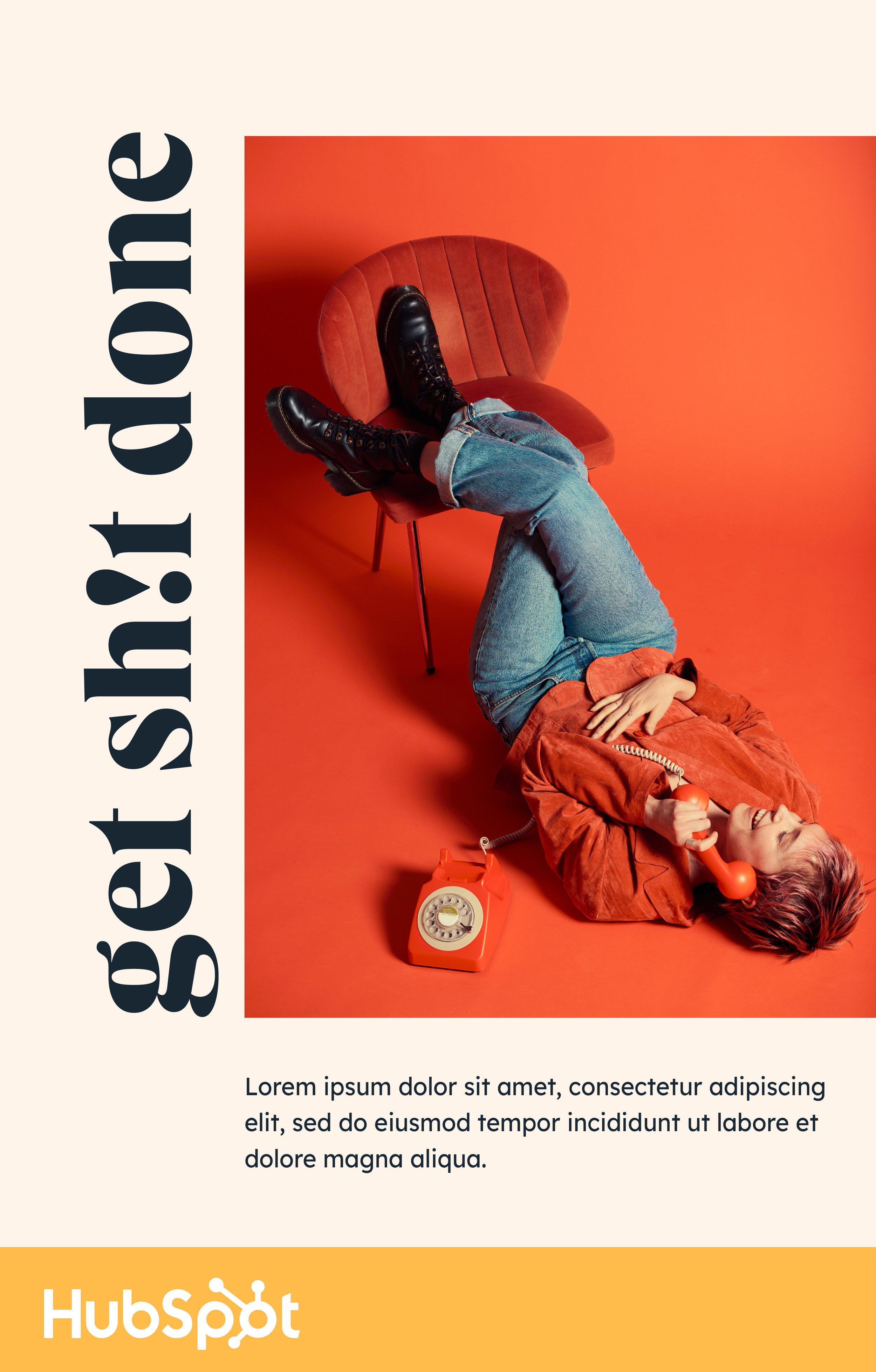
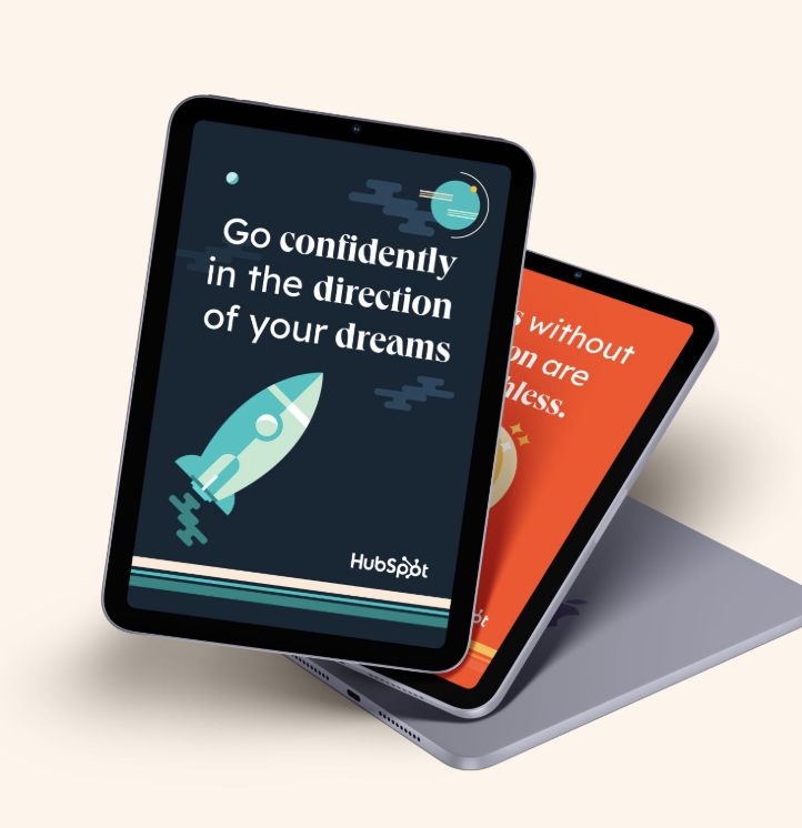
With typefaces, the team concentrated efforts on discovering a similar, but more functional replacement to Avenir Next. After rigorous technical testing, the team selected Lexend Deca to serve as our tried and true, legible sans serif. But we didn’t stop there. To lean into our differentiators, the team selected a more stylistic serif typeface, to add contrast and personality. We’re pleased to introduce Queens, a bold statement typeface, for limited use in large headers.
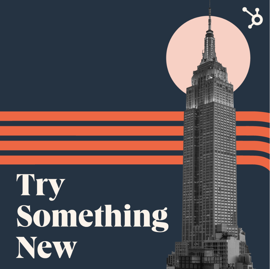
For shape language and illustration, the team pulled in inspiration from mid-century modern design, with a new vibrant and HubSpotty twist. Simple shapes and clean lines paired with vibrant and bold human expressions bring a visually striking art direction to replace HubSpot's former blobs and waves. The new direction is eye-catching and confident. It’s a modern direction with nods to classic and timeless design.
And where would we be without our customers? The brand refresh also updated our photography style to bring more unique, human expressions to our content. The team leaned into a direction that is simple but bold. Photos use rich and vibrant colors but monochromatically or with limited colors. In the end, it's the personalities, expressions, and diversity of the models that's the central feature.

HubSpot Global Rebrand
Creative Direction: Aubrey Zych
Design: Nichol DeRosier & Liz Villate
Photography: Ally Schmaling
Project Management: Allison Carlson
Brand Strategy: Brad Minor, Alicia Collins, and Amy Marino
HubSpot’s internal creative team embarked on a bold mission: to transform into a vibrant, joyful, and distinctly human brand amidst a landscape of sterile, blue corporate alternatives. Our comprehensive rebrand was a collaborative effort between internal brand strategists, designers, animators, web developers, and copywriters who reimagined HubSpot's identity from the ground up.
The initiative delivered a complete brand overhaul, beginning with new positioning and strategy that cascaded into refreshed a color palette, typography, shapes, and illustrations. Drawing inspiration from mid-century design principles, we embraced simple geometric forms and bold color choices while prioritizing function over unnecessary embellishment. This aesthetic perfectly embodied HubSpot's commitment to providing a clean, intuitive, fuss-free, and human-centered CRM experience.