
The process for updating the visual identity began with the creation of HubSpot’s new brand positioning. The Brand Marketing and Creative Teams partnered up to define our positioning in the larger market, and how we could best differentiate ourselves amongst competitors like Salesforce. The results were clear: the market was dull, sterile, and prioritized numbers over people. Disconnected CRM solutions made business software impersonal, and a drag to use. HubSpot shines brighter than our competitors as a vibrant, joyful, human-centered alternative. This ultimately became our north star:
In a category that turned growth into a machine, HubSpot is the CRM that makes it human again.
Results & Impact:
1,500+ brand assets redesigned across marketing, product, events, and sales
30+ global teams adopted the new visual identity
Under 6 month turnaround time from inception to company rollout
Supported the company's continued growth to 200,000+ customers worldwide
Earned coverage in Adweek, Fast Company, The Boston Globe, and Marketing Brew

Governance & Enablement
A brand is only as successful as its adoption. To ensure the new identity could scale across 7,000+ employees operating in 120+ countries, we built the systems that enabled teams to create confidently while maintaining a consistent brand experience.
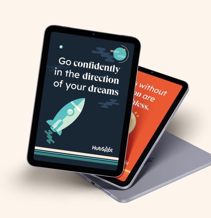
The rollout included 700+ Canva templates, a fully redesigned Google Slides presentation system, dozens of Figma libraries for the creative team, 250+ modular website components, an animation library with 100+ reusable motion templates, and centralized photography and video libraries. Rather than treating the rebrand as a one-time launch, we created a scalable creative ecosystem that balanced consistency with flexibility, allowing the brand to evolve without sacrificing quality.
The refresh was designed to establish HubSpot as the vibrant, joyful, and distinctly human alternative in a category dominated by sterile corporate sameness.
Mid-century modern design became the perfect metaphor for that ambition. Mid century modern design stripped away excess noise and clutter, and used the possibilities of modern industrialism to make everyday products simpler, more useful, and easier to live with. It offered an optimistic vision of progress, one where technology made life feel more intuitive, accessible, and enjoyable.
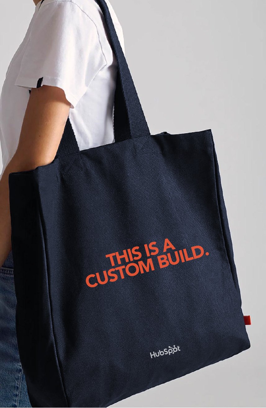
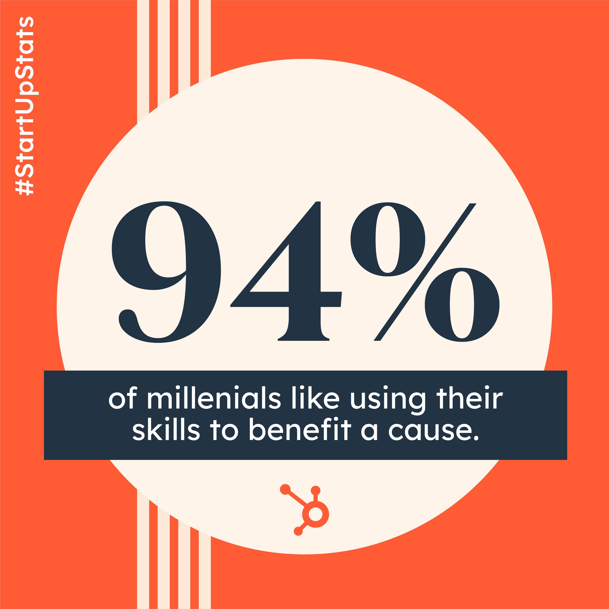
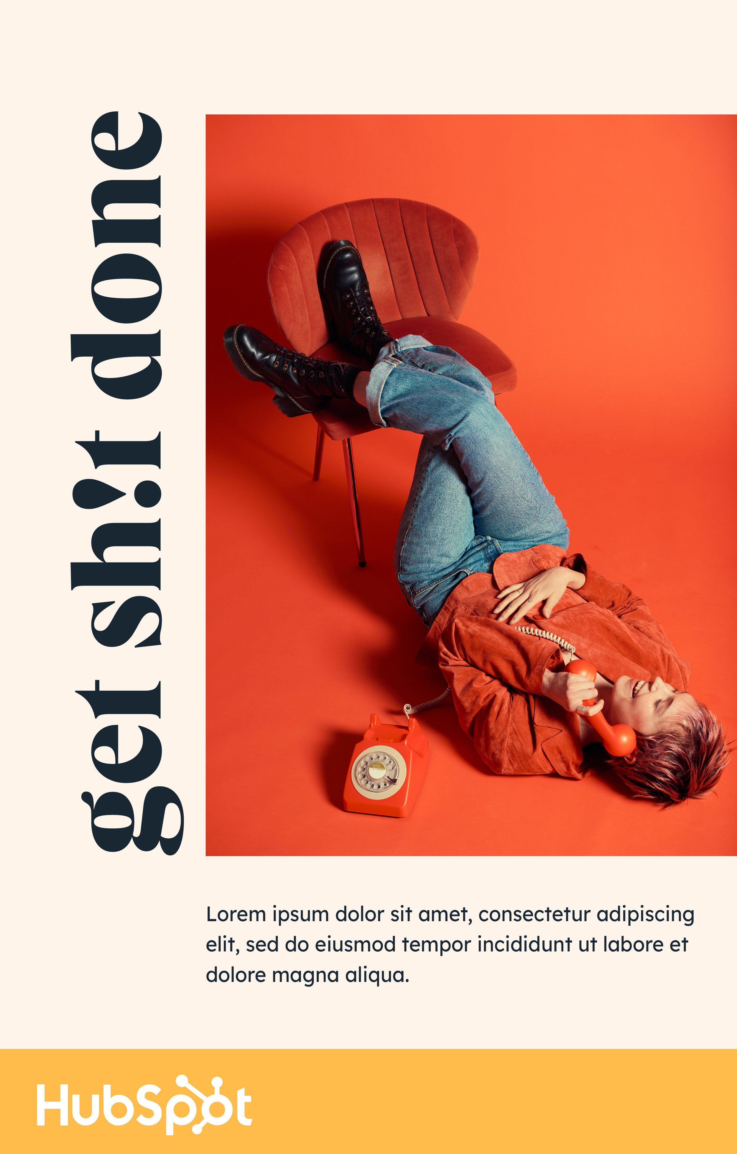
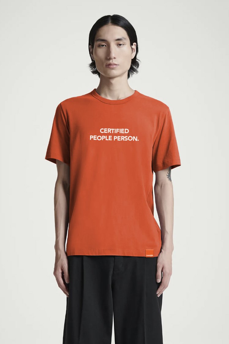
HubSpot brought that same philosophy to business software. Growing a company did not have to feel cold, complicated, or impersonal. The new brand identity used bold color, clean geometry, expressive typography, warm photography, and moments of levity to make the brand feel sophisticated without becoming corporate, and powerful without losing its humanity.
The result was a visual system that reflected the experience HubSpot wanted to deliver through its products and customer relationships: easy to use, genuinely helpful, and rooted in the belief that business growth could still feel joyful.

HubSpot Global Rebrand
Role: Creative Direction
HubSpot had grown from a single-product startup into a global, multi-product platform, but it was competing in a category largely defined by Salesforce and other giants. While Salesforce owned scale and enterprise authority, it was often associated with complexity, corporate sameness, and an impersonal customer experience. HubSpot needed a distinct position it could credibly own as it moved further upmarket.
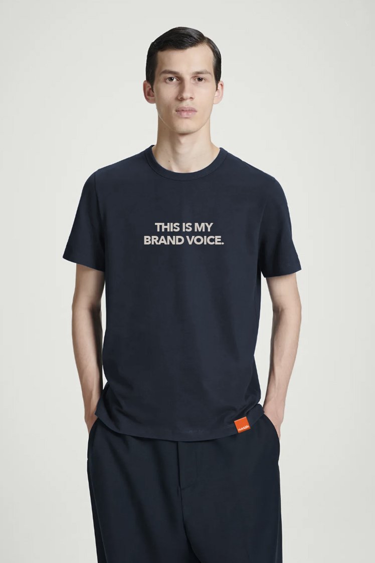
We repositioned HubSpot as the more human alternative to traditional enterprise software: approachable, joyful, easy to use, and built around helping people grow. The comprehensive rebrand included an updated brand strategy, visual identity (color, typography, photography, illustration, motion, product visuals), tone of voice, enablement materials (website components, campaign templates, presentation systems, video templates, etc) and a comprehensive brand playbook.
The rebrand established a cohesive global identity across HubSpot’s products and marketing ecosystem, while enabling more than 8,000 employees to create on-brand work at scale. Combined with the launch of the global brand campaign, HubSpot acheived a double digit brand lift while improving performance across web and demand gen.












































Credits:
Creative Direction: Aubrey Zych
Design: Nichol DeRosier & Liz Villate
Photography: Ally Schmaling
Project Management: Allison Carlson
Brand Strategy: Brad Minor, Alicia Collins, and Amy Marino
Project Leadership, Authorship, and Attribution: The HubSpot Rebrand was an autonomous, in-house initiative creatively led by Aubrey Zych, with executive sponsorship from Brad Minor, VP of Brand. Aubrey authored the foundational creative vision, established the global art direction, directed the visual identity system, and led the project’s design and execution with its dedicated internal team.
72andSunny supported a separate but adjacent brand campaign that launched alongside the rebrand and contributed to high-level brand architecture in partnership with HubSpot’s internal brand strategists.
Only the individuals and teams explicitly credited on this page contributed to the strategy, creative direction, design, or execution of the HubSpot Rebrand. No uncredited departmental leader or external partner held an additional or undisclosed oversight role.