
Vistaprint Global Rebrand
Role: Designer & Editor
Collaborated with internal team of designers and external design agency, Tank Design, to bring the rebrand to life across all channels. Worked on visual development, employee enablement, and executions across video and social.
As Vistaprint shifted its focus toward customer-centricity, the brand identity needed to evolve to reflect a new commitment to authenticity, value, and professionalism, without losing its accessibility to micro-businesses.
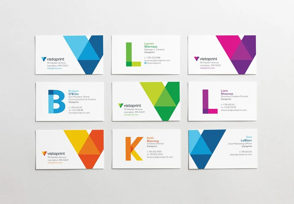
The layered, color-rich aesthetic of the new logo informed every brand touchpoint, from business cards and packaging to web design and social content. Across both digital and print, the art direction celebrated transparency, texture, and color interaction, turning every piece of collateral into a subtle nod to the craft of printing.
A complete brand system was developed to unify the look, feel, and voice across global teams. This included a new logo, typography, and color palette, as well as a comprehensive Global Brand Book that codified the brand voice and creative principles.


The rebrand emphasized a balance of professionalism and approachability, value-driven but never cheap, global yet locally grounded. The visual system leaned into Vistaprint’s roots as a printmaker, using layered shapes, translucent color overlays, and blend modes to echo the tactile, dimensional nature of ink on paper. This approach gave the identity depth and meaning, transforming a simple triangle into a symbol of connection, craft, and the vibrancy of small business.
The new design stood in sharp contrast to the previous logo, which leaned heavily on the literal CMYK color model. While this reference resonated with printers, it felt alienating and visually dated to modern customers. Where the old mark felt technical and transactional, the new identity prioritized clarity, warmth, and a contemporary sense of trust. It signaled a shift from being a low-cost printer to a partner in entrepreneurship, visually reinforcing Vistaprint’s evolved brand promise.

To connect the brand directly to its customers, the new mark was brought to life using real-world elements from the workspaces of small business owners, including tailors, bakers, florists, and machinists. These visuals symbolized the brand’s deep integration into everyday entrepreneurial life. By anchoring these components of small business owners within the shape of the "V," the mark became more than a logo; it became a window into the stories and environments of the business owners Vistaprint serves.
Over time, this flexible yet consistent framing device helped build brand recognition and equity in the "V" itself, allowing it to function as both symbol and storytelling tool.


