
Performance Case Studies
Great creative should do more than look good. It should make the product easier to understand, help teams move faster, and contribute to measurable business outcomes.
That can mean building a system that allows a global rebrand to scale without losing consistency. It can mean simplifying a complex product story so audiences immediately understand the value. Or it can mean helping Creative and Demand Gen stop treating brand and performance as competing priorities.
The case studies below show how I approach creative as both a craft and an operating system: something that should be distinctive, clear, repeatable, and built to work hard for the business.
A Scalable Rebrand for 8,000 Employees
Bringing Clarity to a Complex Product Interface
How Better Creative Cut Cost per Lead by 44%
CASE STUDY
A Scalable Rebrand for 8,000 Employees
Let’s face it: rebrands can create as much anxiety as excitement. Internally, they often mean outdated assets, broken templates, and hours of manual work just to catch up. It can be really hard to get folks across the company on board, and the challenge was even more daunting at an enterprise with 8,000 employees across hundreds of teams.
When HubSpot rebranded, the challenge wasn’t simply creating a new visual identity. It was building a system that could support 8,000 employees, multiple products, global markets, and hundreds of teams producing work at very different levels of creative expertise.
As the main driver of HubSpot’s rebrand, I wanted this rollout to feel different from other rebrands. Instead of handing employees a new set of guidelines and asking them to rebuild everything themselves, we gave them the tools, resources, and templates to be up and running from day one.
Building the brand into the infrastructure
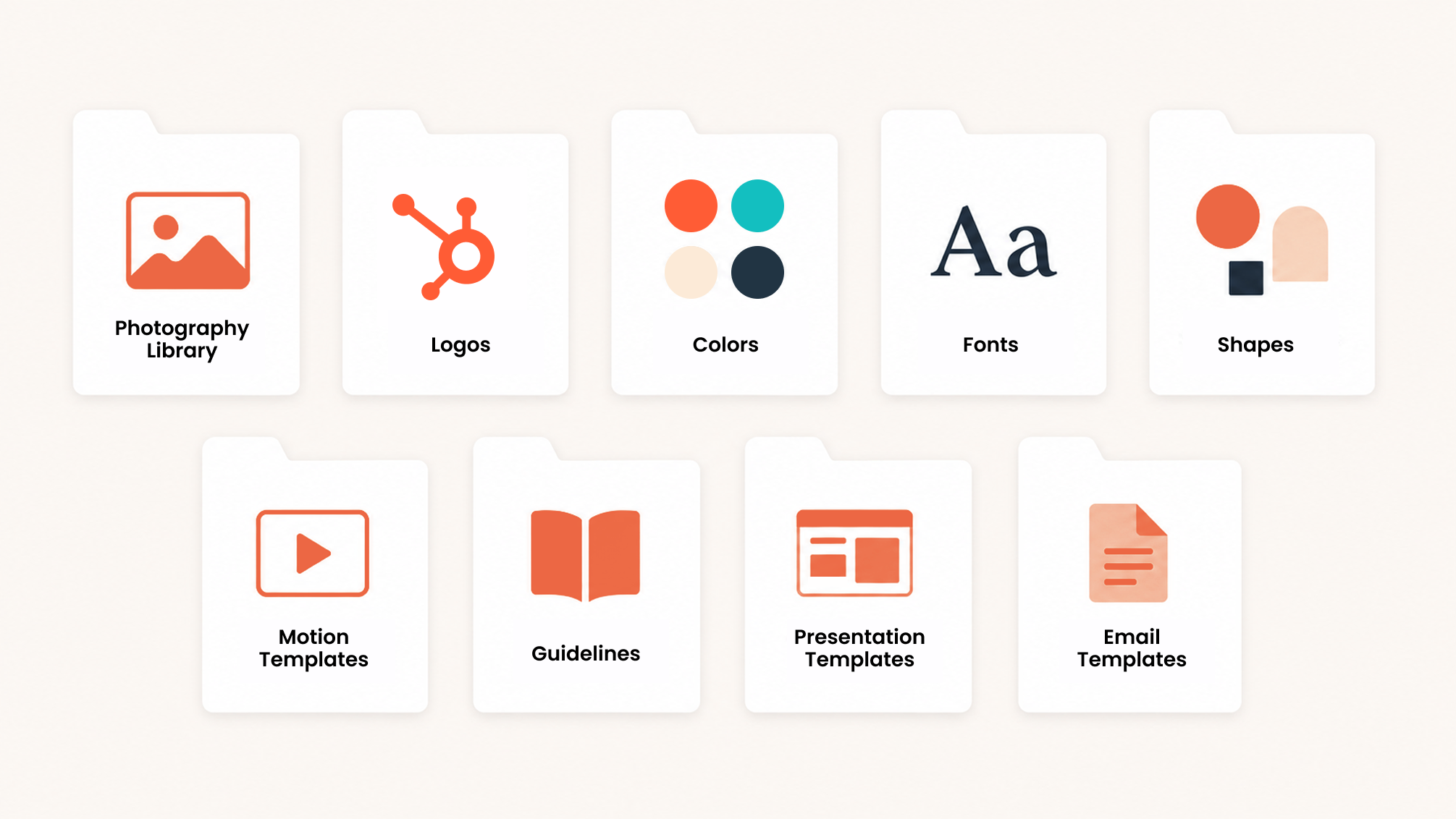
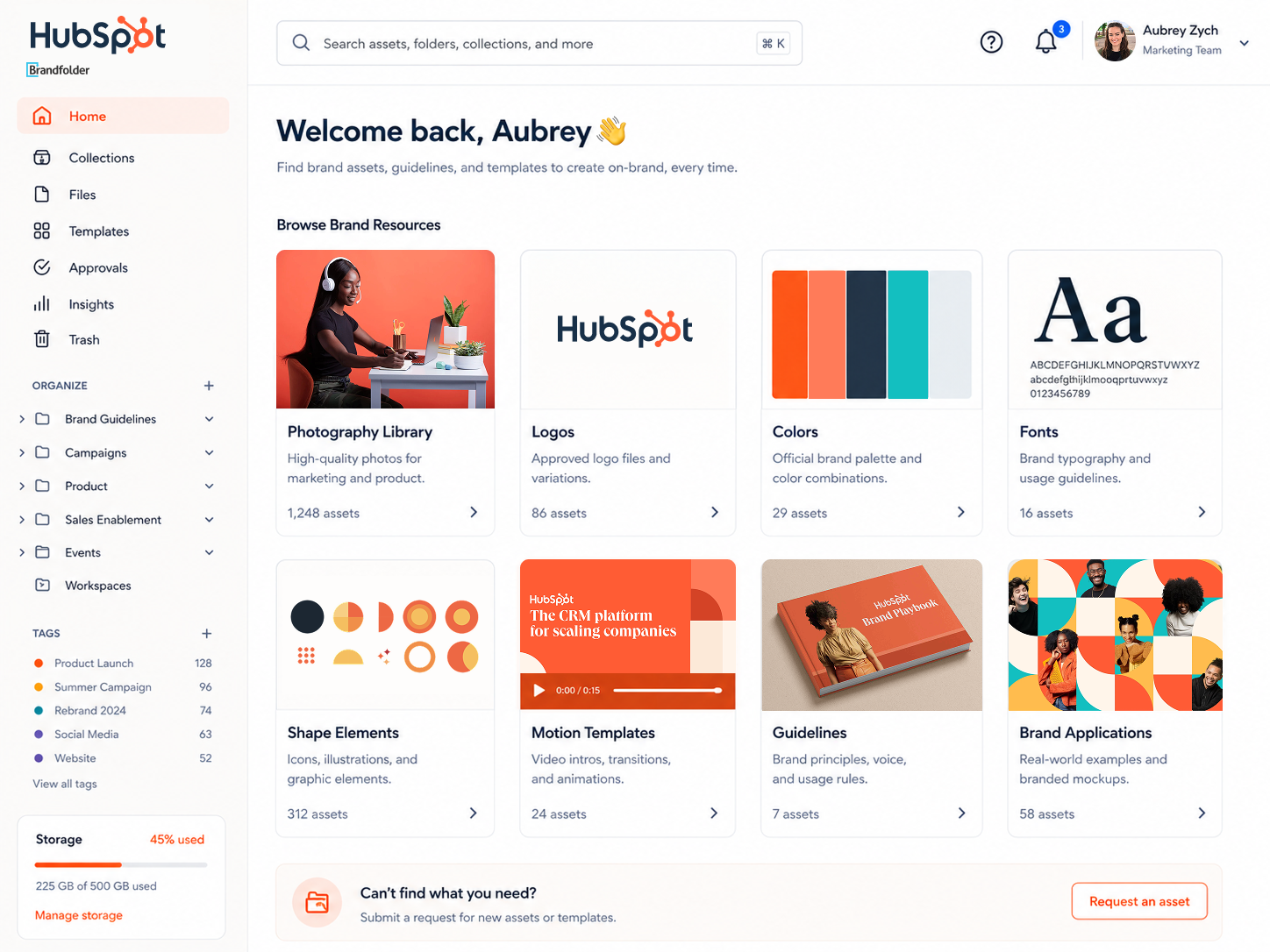
We intentionally launched the rebrand alongside a new digital asset management platform, Brandfolder. This way, the announcement of the rebrand and the tools needed to adopt it arrived at the same time.
The message was simple: here is the new brand, and here is exactly where to find everything you need to use it.
From day one, employees had access to the photography, video, logos, guidance, templates, and supporting resources behind the new identity. That included a comprehensive Figma library, more than 250 reusable website modules and components, over 700 Canva templates, a fully refreshed presentation slides, 1,000 new photos, and hundreds of video and animation templates.
There was no gap between launch and enablement. The brand was not introduced as a static set of guidelines, but as a complete operating system people could begin using immediately.
Designing for adoption from the start
Before launch, we interviewed teams and stakeholders across the company to understand what they needed from the new system. We already had a strong view of the core brand infrastructure because we owned so much of it, but those conversations helped surface less obvious use cases, workflow gaps, and team-specific needs.
They also gave employees an early signal that the rebrand was coming and a meaningful opportunity to shape the rollout. When the system launched, teams could see their input reflected in the resources available to them.
The Impact
The system allowed HubSpot to scale a cohesive global brand without forcing every request through a centralized creative team.
Teams could move faster, designers spent less time recreating common assets, and employees had clearer guardrails for producing high-quality work independently. Just as importantly, the rollout reduced the burden typically associated with a rebrand. People were not simply told what had changed. They were given the tools to participate in it immediately.
The rebrand did not scale because everyone memorized the guidelines. It scaled because the right choices were built into the tools people used every day.
CASE STUDY
Bringing Clarity to a Complex Product Interface
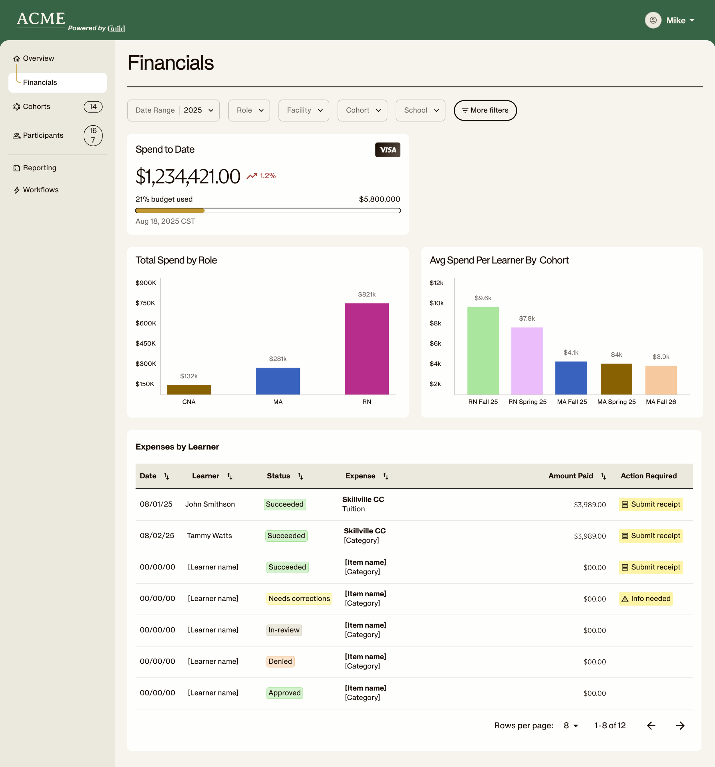
Like many enterprise technology companies, Guild’s product is feature-rich by design. Its interface supports multiple audiences, workflows, and decisions, making it powerful for users but difficult to explain quickly in marketing. Full-screen screenshots showed everything the platform could do, but asked viewers to process everything at once.
In a video or social feed, that level of density created too much visual confusion. The most important action could easily disappear, while excess information that wasn’t relevant to the story could steal focus.
We did not need to simplify the product. We needed to make the product simpler to understand.
Turning a single execution into a future-proof system
The most successful creative projects are rarely one-and-done.
The same component-based approach could then be adapted across landing pages, paid campaigns, social content, and other marketing experiences. Instead of relying on static screenshots. Rather than invent a new visual treatment for every channel, we had a flexible system for highlighting the exact feature, action, or benefit each story required.
It gave marketing a clearer way to explain a complex platform while creating a product visual language that could scale.
Showing workflows in context
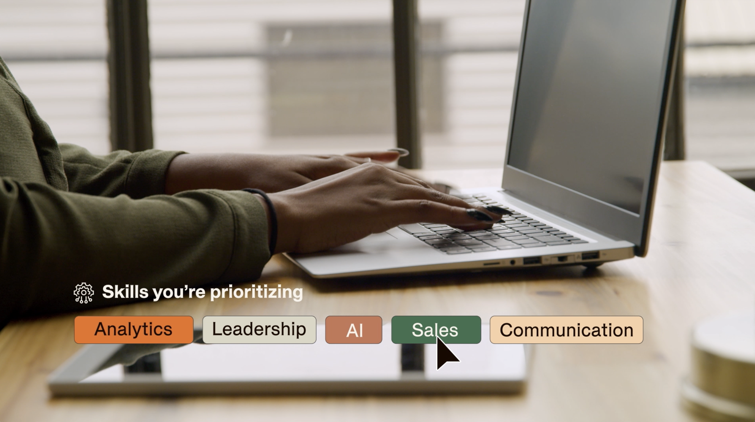
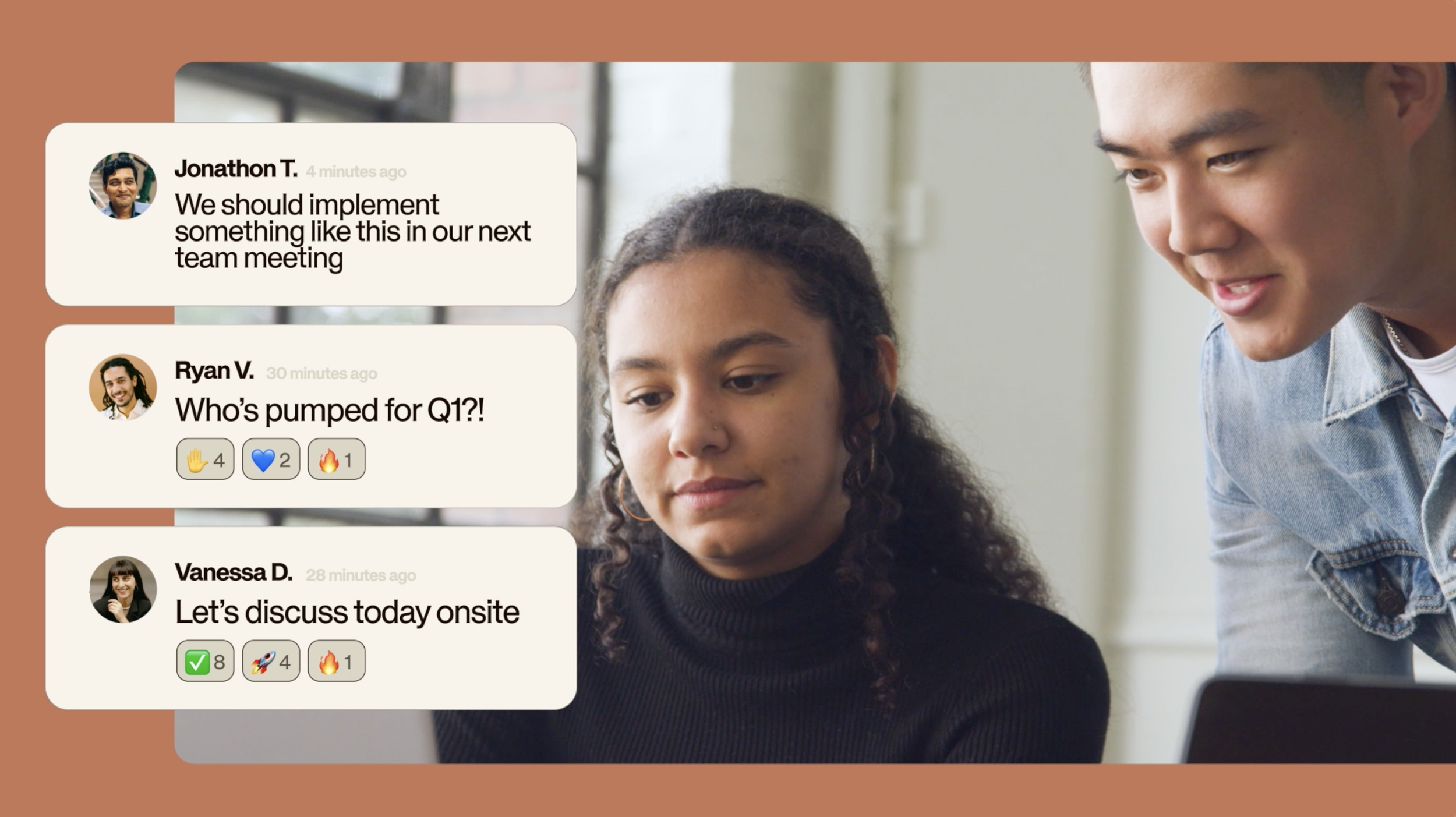
Pulling individual UI components out of the full interface also created more room to show the customers using them.
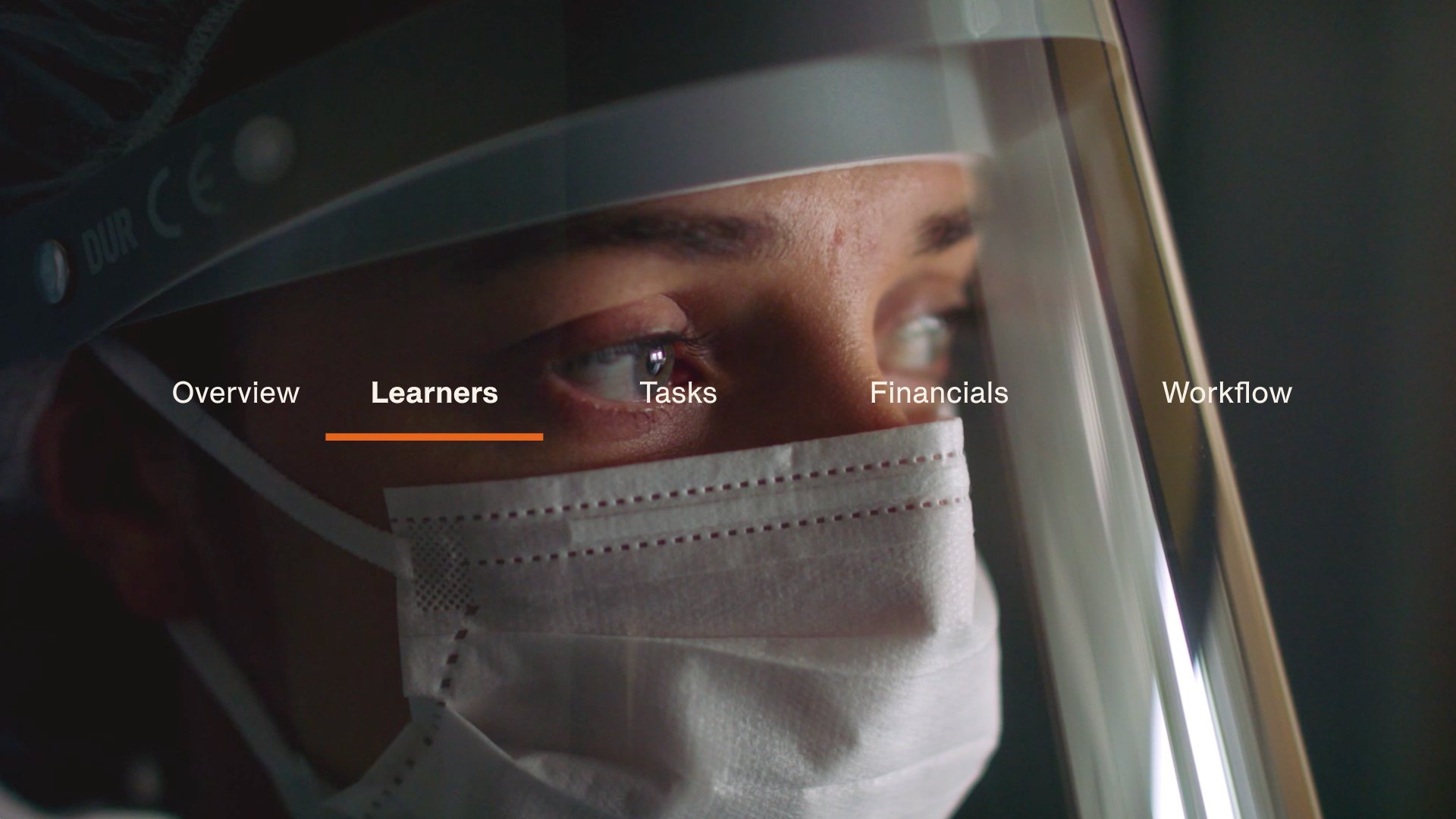
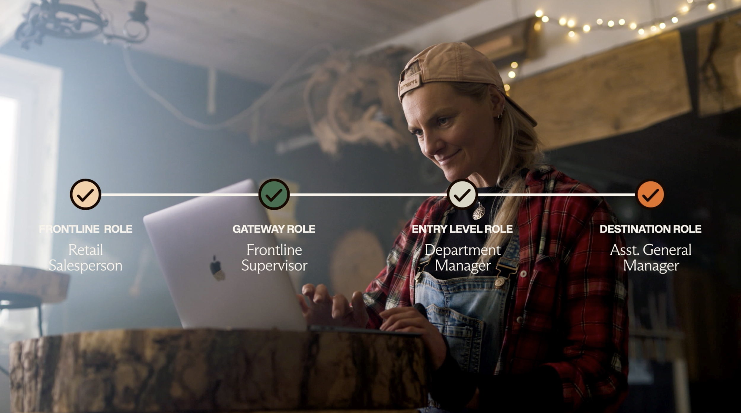
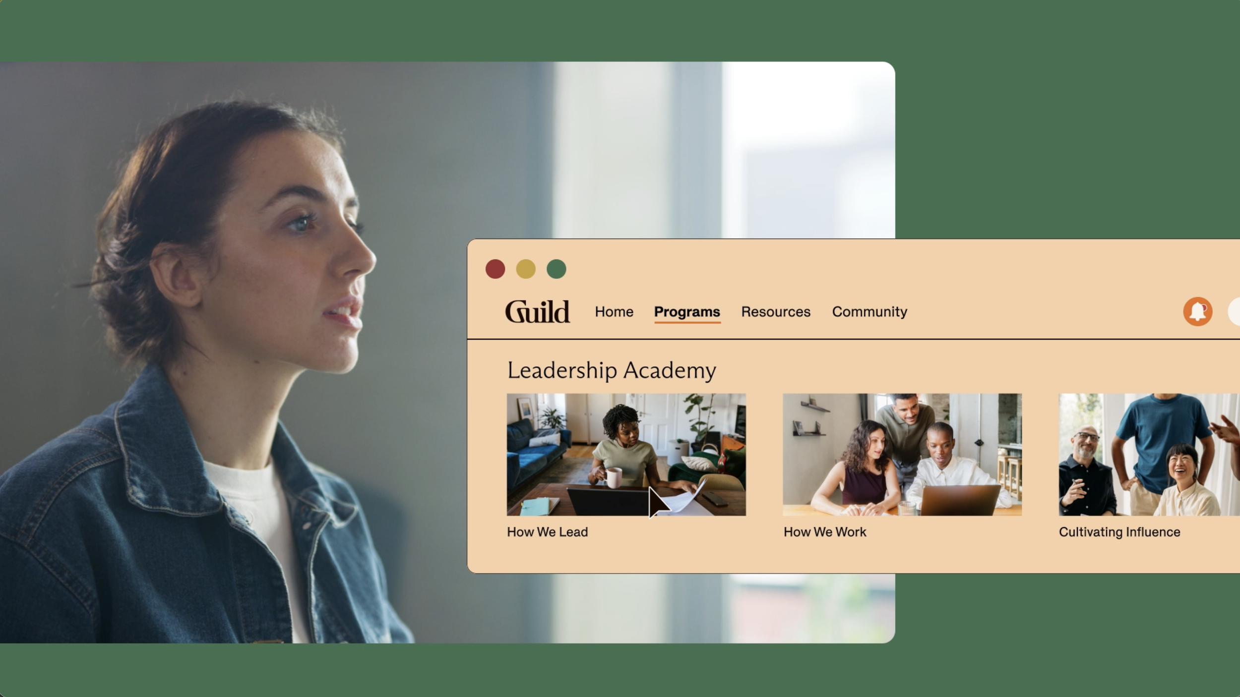
Instead of filling the screen with software, we could layer product moments over footage of employees at work, learners in class, or people navigating important career decisions. The audience could see not only what the product did, but where it fit into someone’s day and how it affected their work, growth, or experience.
That balance made the storytelling more human, and allowed us to tell more with less time and real estate. The interface provided the proof, while the customer remained at the center of the story.
Proving the approach through results
I piloted the system across three product overview videos, each approximately 90 seconds long. Despite their length, all three demonstrated unusually strong viewer retention:
Grow: 70-second average view time, or 66% retention
Academy: More than 80 seconds, or approximately 85% retention
Navigator: 60 seconds, or 59% retention
Those numbers show remarkable retention for long-form product marketing. Viewers were not simply staying long enough to understand the premise. They were continuing through the majority of the story, including the product detail that followed.
More importantly, some viewers reached the end and converted directly through the video’s embedded CTA. They watched the product story, understood the value, and proactively asked to learn more from Sales without leaving the experience.
The videos did not just hold attention. They turned attention into intent.
Showing only what matters
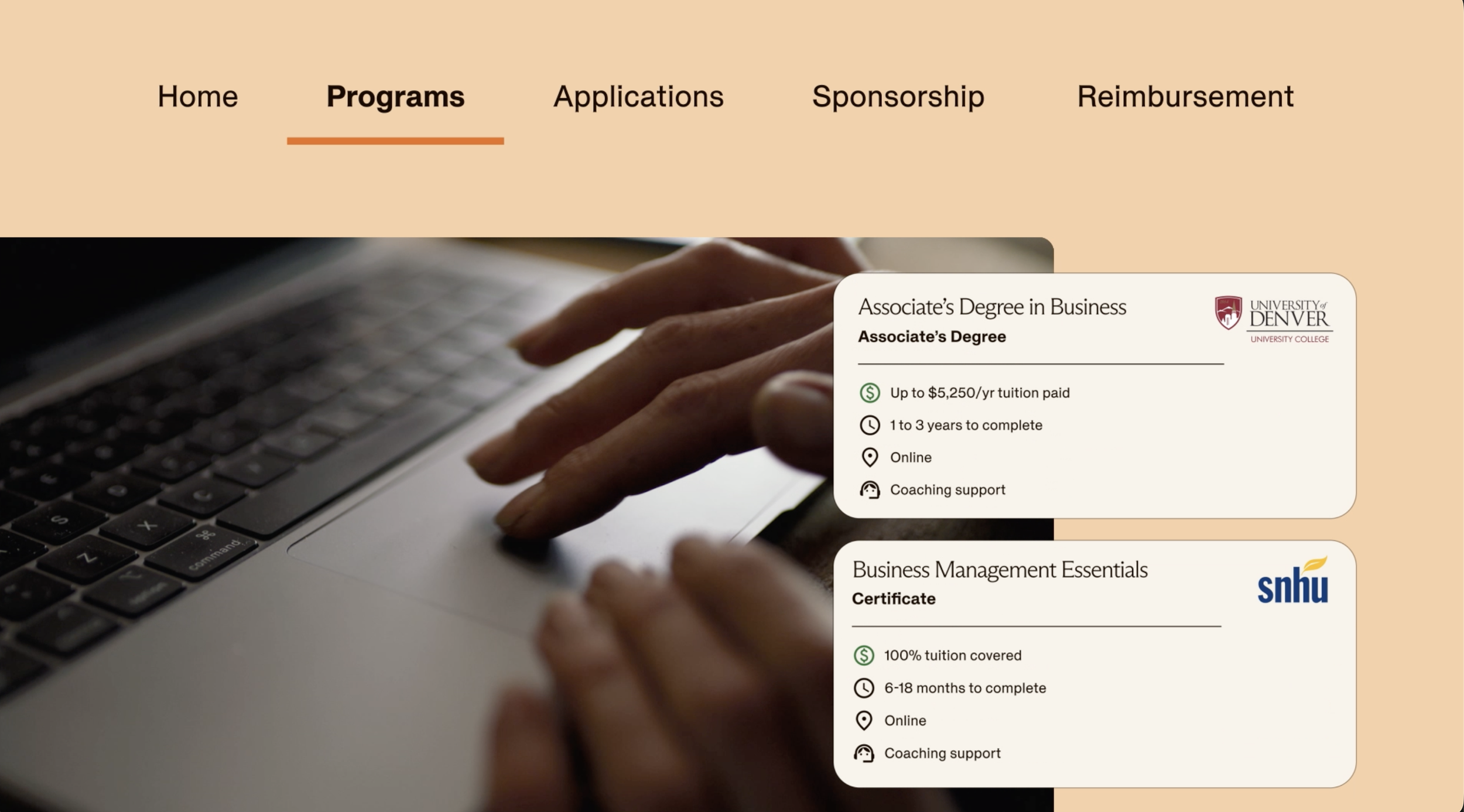
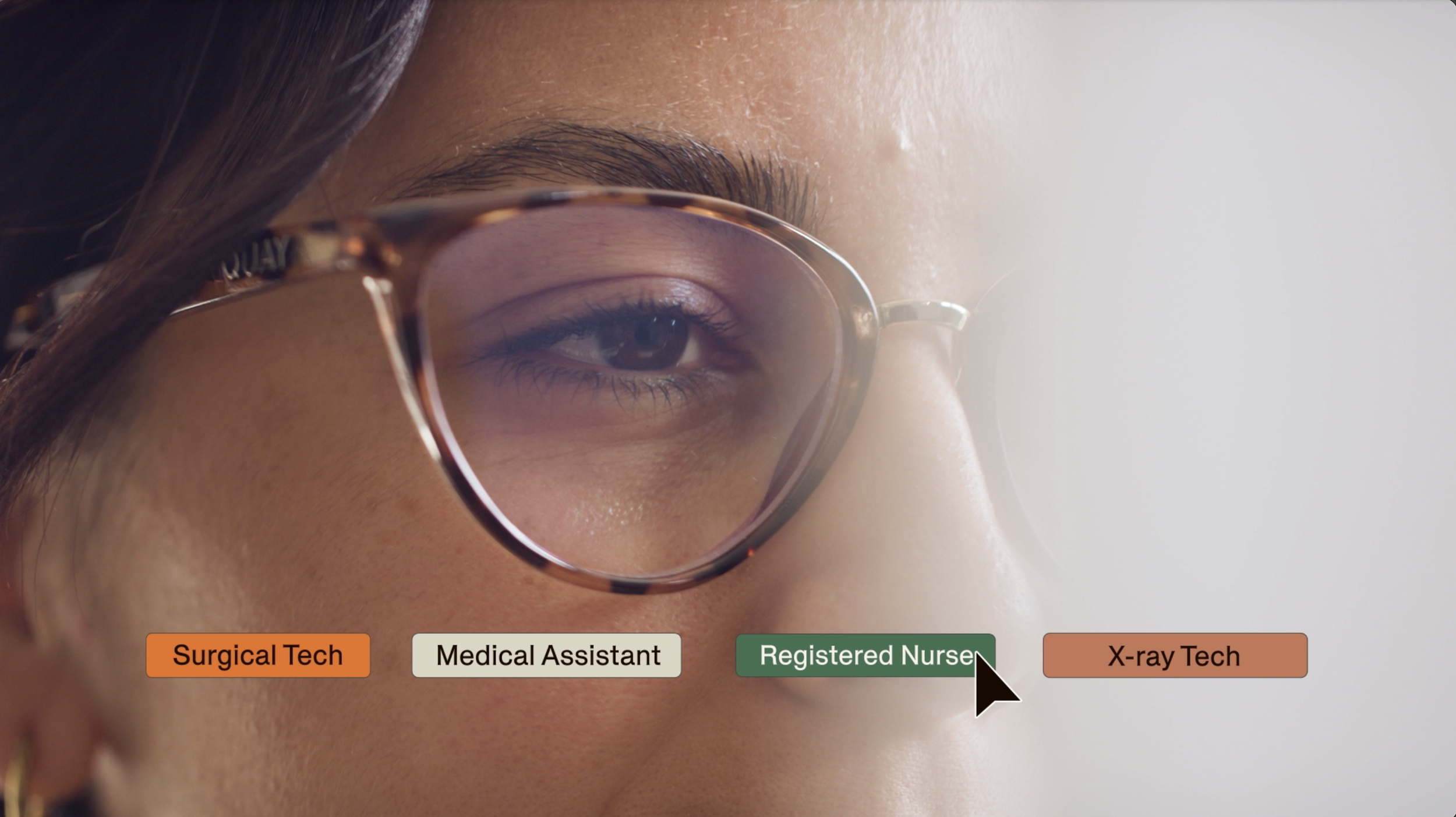
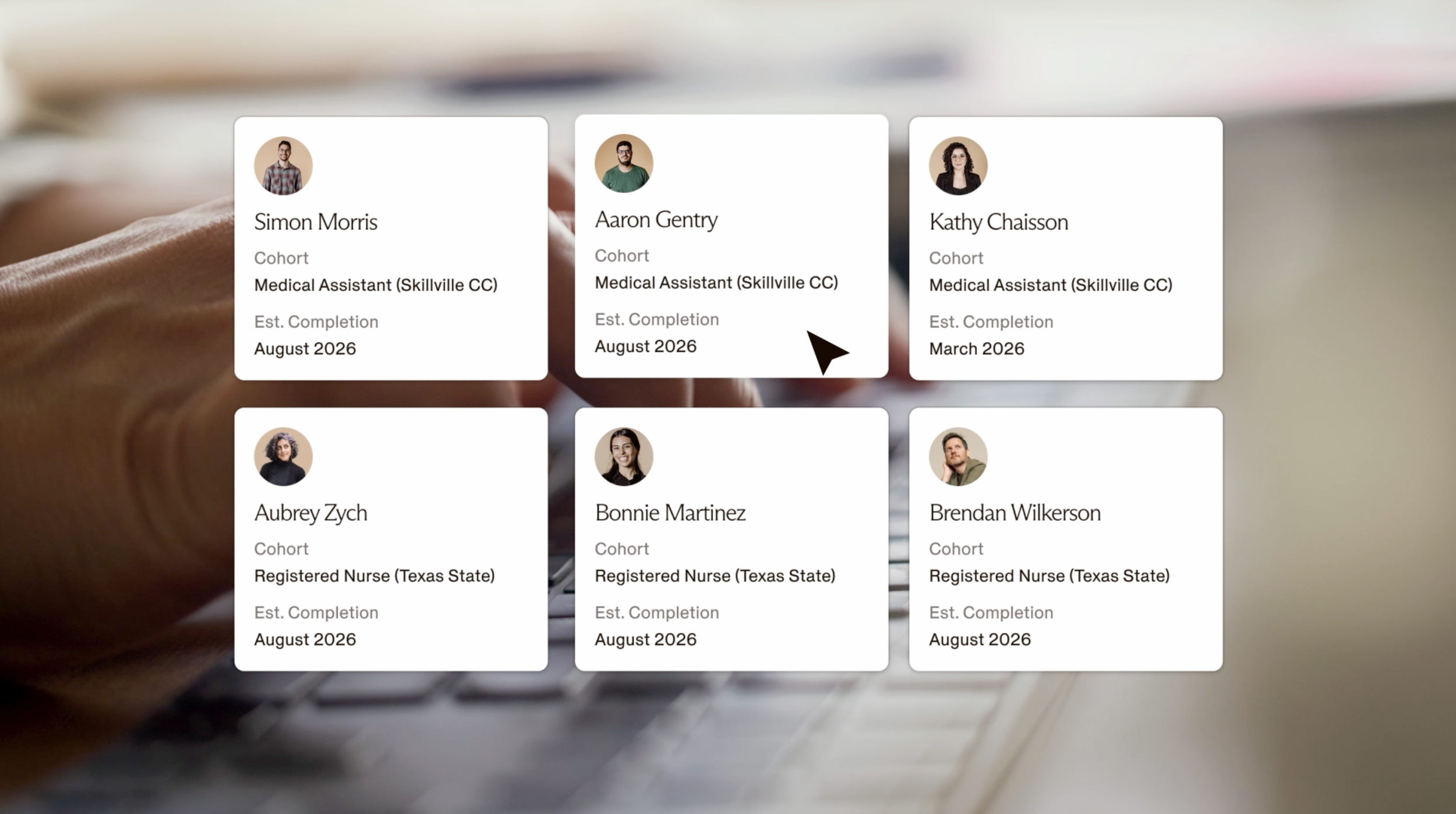
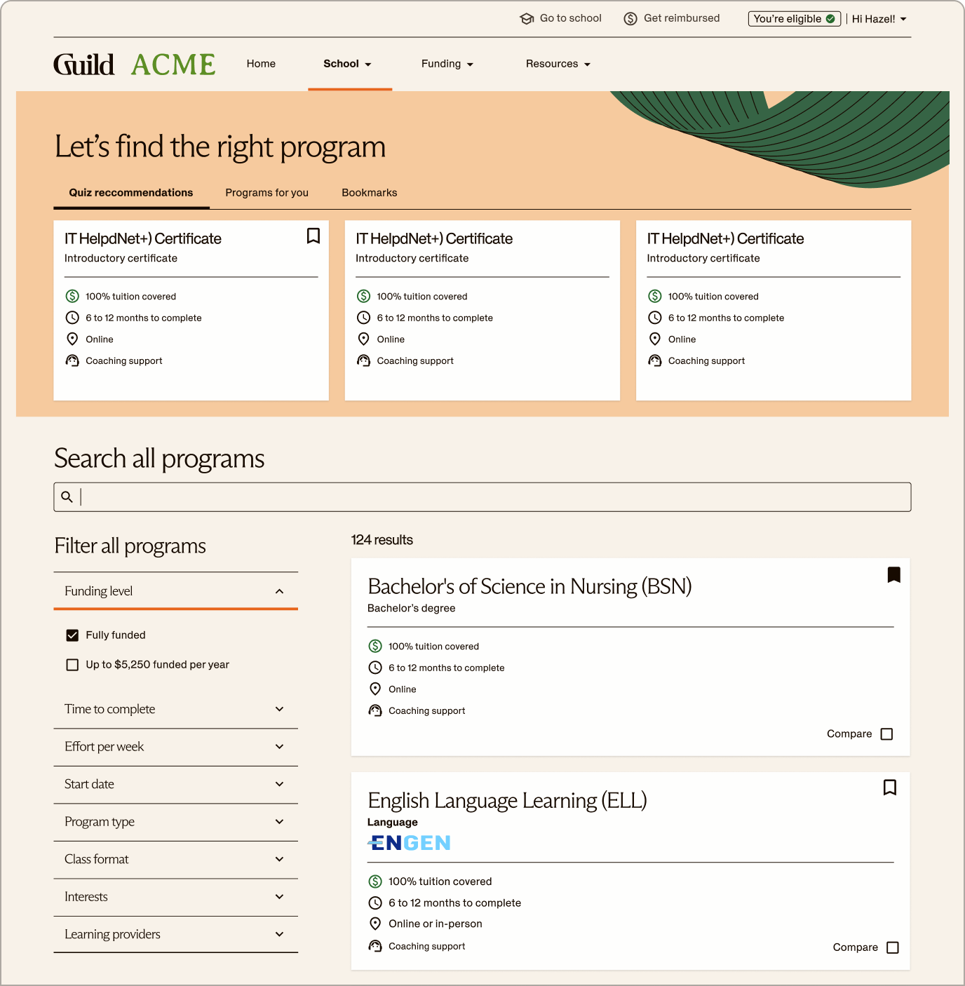
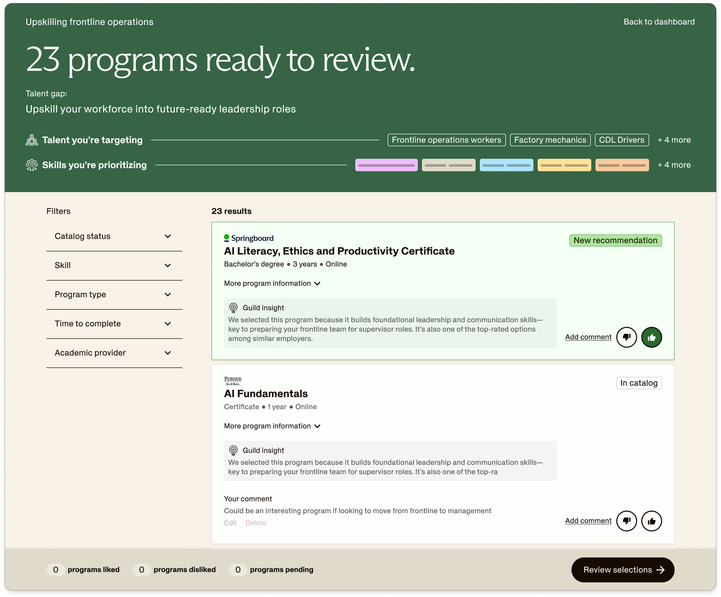
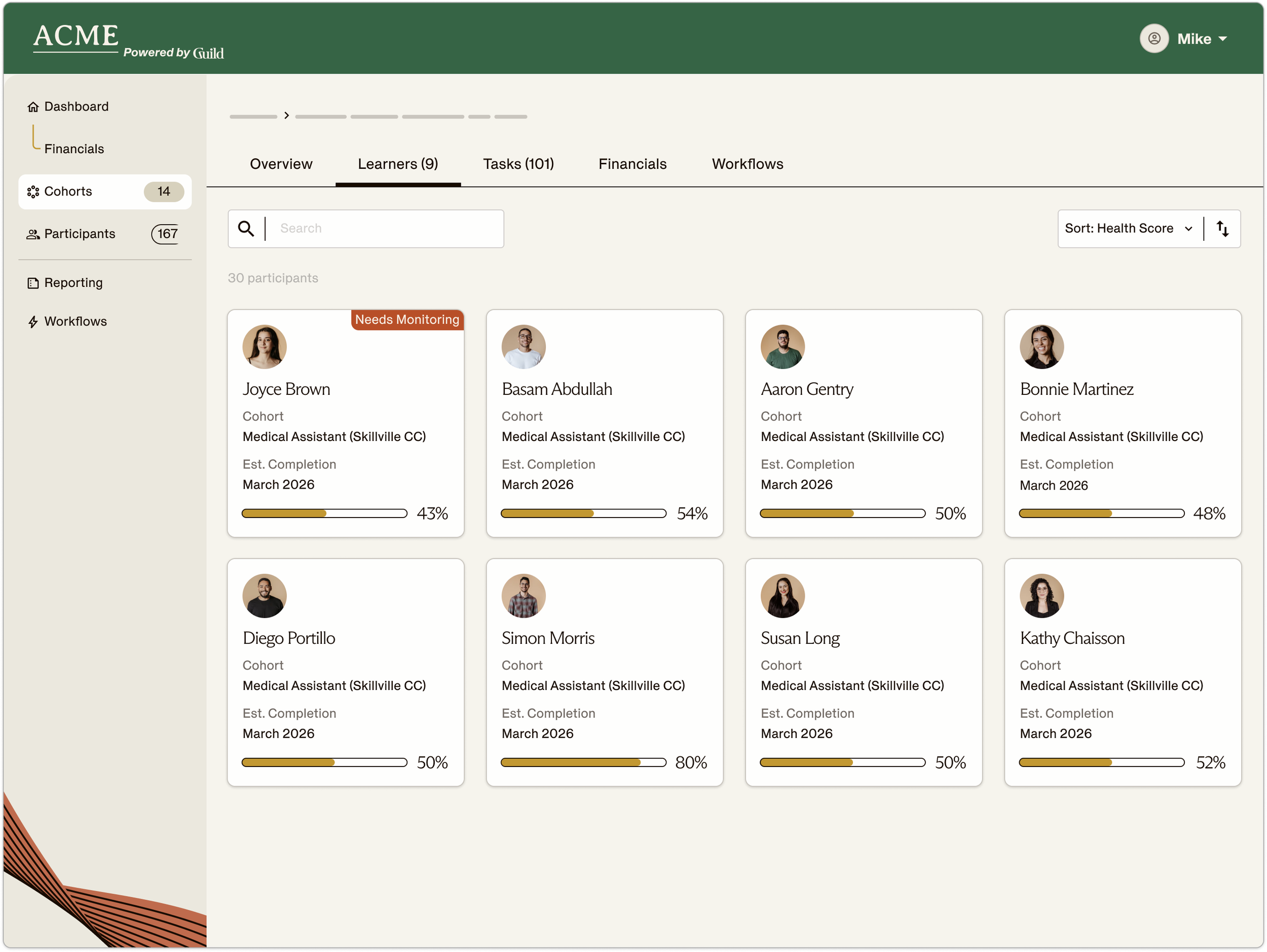
Instead of presenting the interface as a complete screen, I pulled it apart into individual components and isolated the exact feature or action each scene needed to explain.
A recommendation card, progress indicator, search result, or learning pathway could be separated from the surrounding navigation to give the audience one clear focal point at a time.
The product stayed recognizable and authentic, but viewers no longer had to search the screen to understand what mattered.
Reimagined for videos

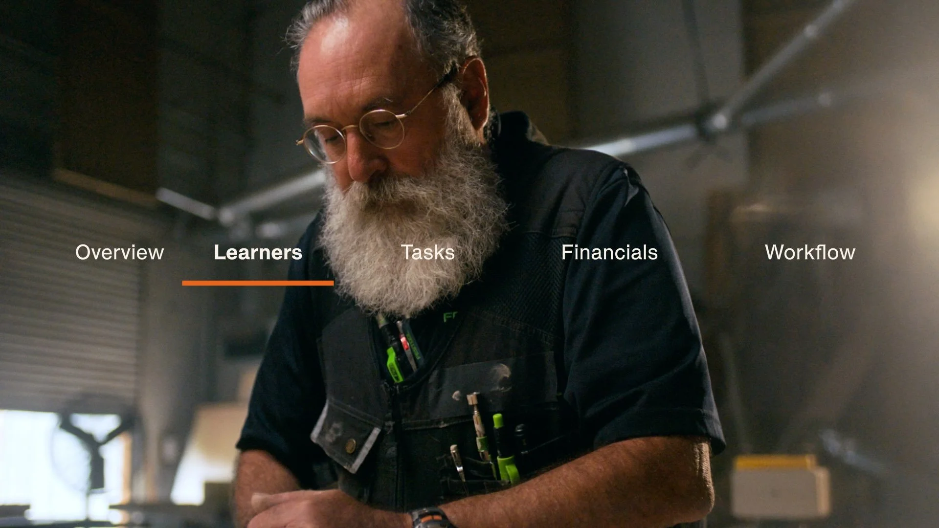
Actual Product UI
CASE STUDY
How Better Creative Cut Cost per Lead by 44%
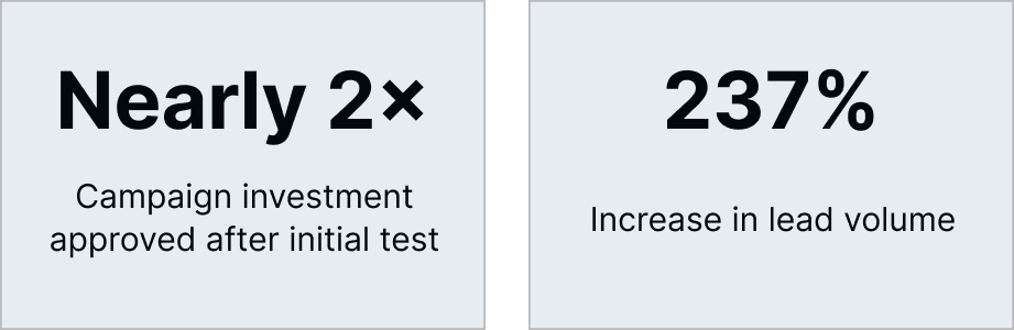
How I partnered with Demand Gen to improve CTR, unlock nearly 2× the campaign budget, and increase lead volume by 237%.
When I joined Guild, Creative and Demand Gen were working toward different definitions of success.
Creative was focused on protecting the integrity and consistency of the brand. Demand Gen was focused on producing work that could capture attention, generate leads, and improve campaign performance.
Both goals were valid, but they were often treated like opposite ends of a tightrope: strengthening one meant pulling away from the other, and collaboration inevitably required someone to compromise.
My very first initiative at Guild was to improve our ad performance. That began by shifting both teams’ mindsets from a tightrope to a Venn diagram. The strongest advertising can do both: feel unmistakably on-brand and work unmistakably hard.
Together with my teammate on Demand Gen, Giselle, we explicitly designed the initiative as a controlled LinkedIn test, keeping the audience, campaign objective, targeting, and lead definition consistent so we could isolate the impact of the creative refresh.
Creative Optimizations
At HubSpot, I spent years working in a deeply results-driven marketing organization where creative was expected to build the brand and contribute to demand. I brought that perspective to Guild from day one, applying a set of proven performance principles to the first creative refresh: make the message faster to understand, the offer harder to miss, and the visual execution more effective in-feed.

After
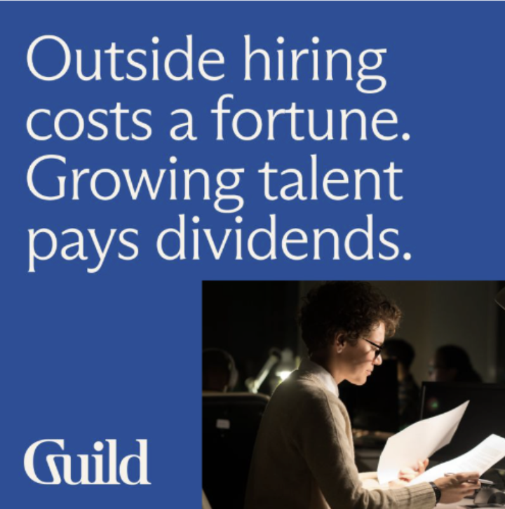
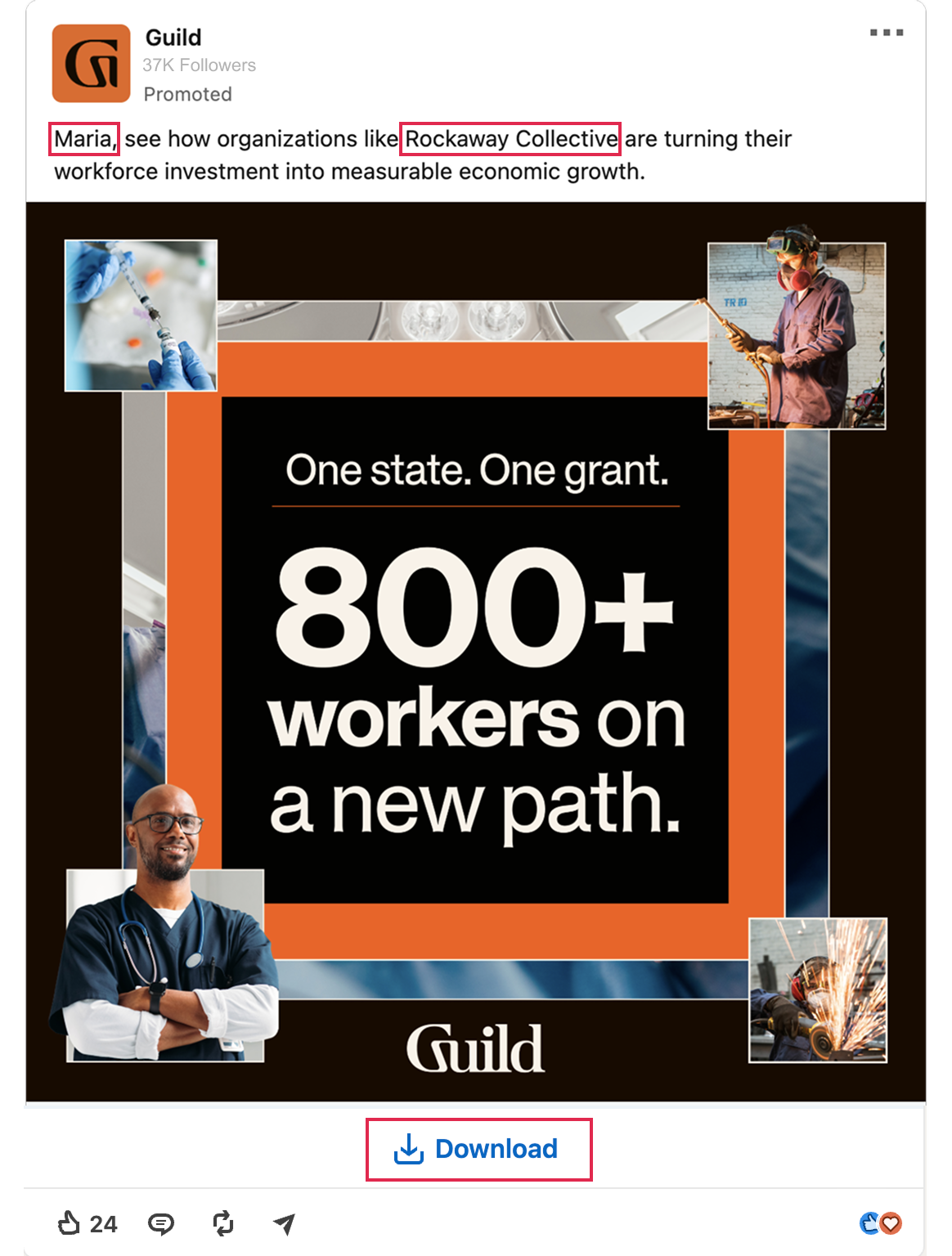
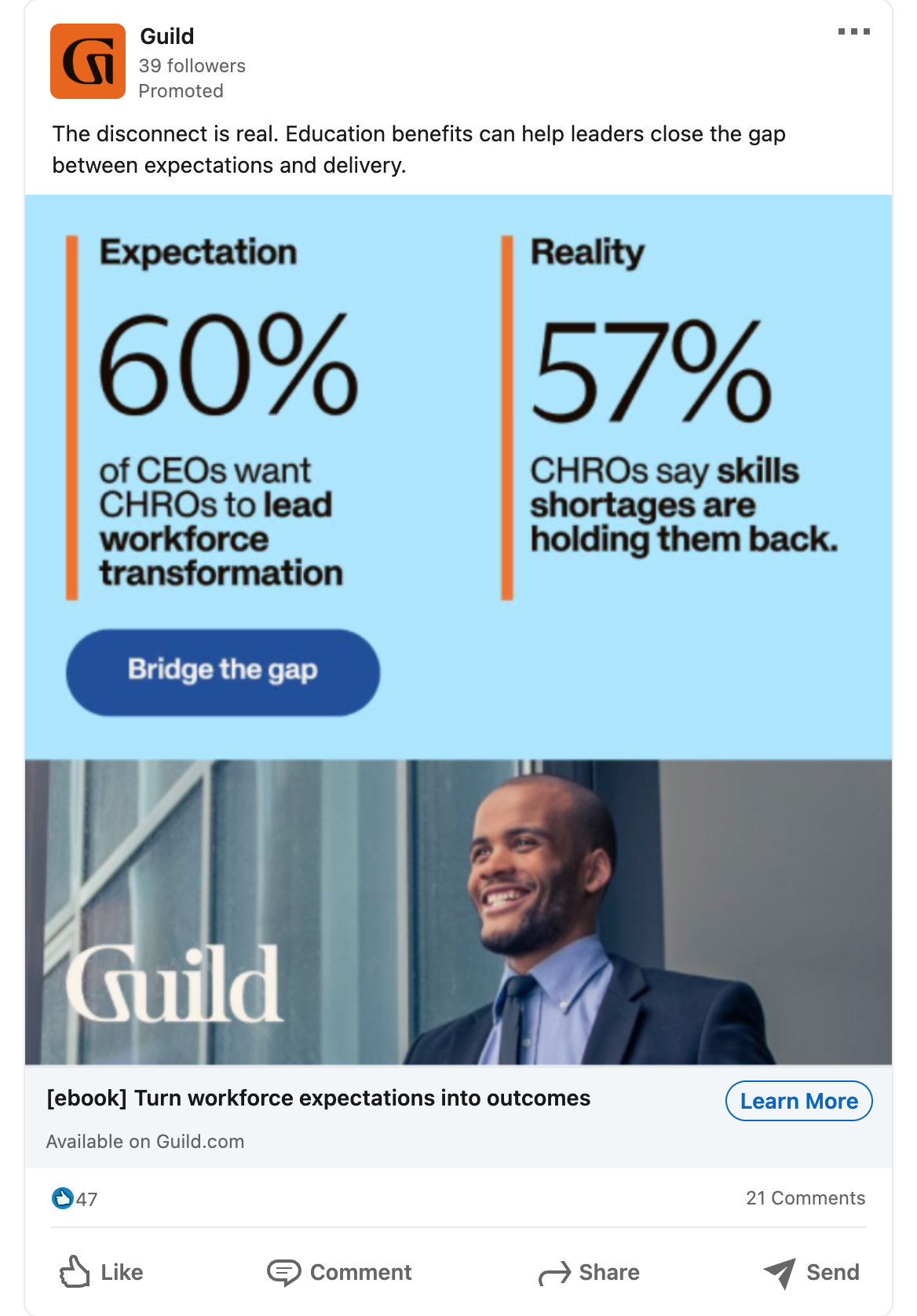
Shorter, punchier copy: Reduce the amount of information competing for attention on an already cluttered feed. Avoid corporate lingo.
Larger typography: Make the key message easier to understand at a glance and on mobile.
The Results
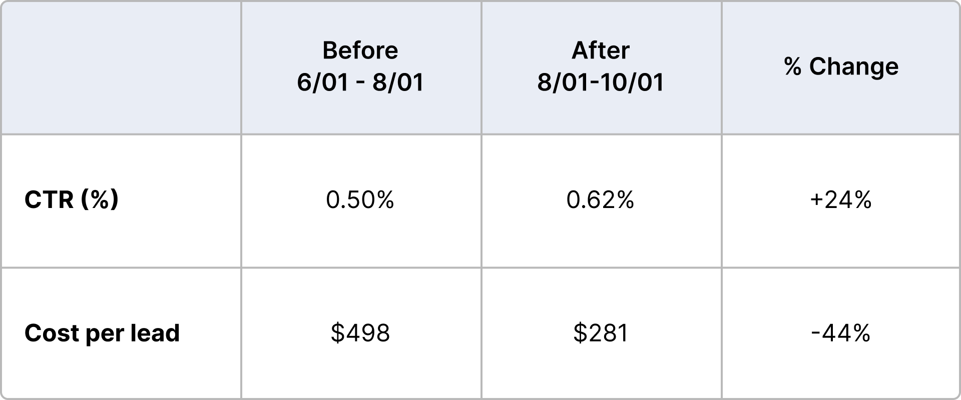
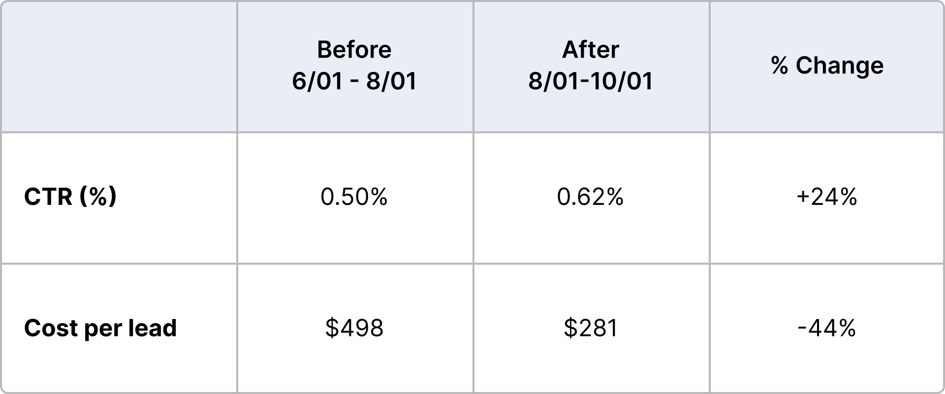
The first creative refresh produced an immediate performance lift. Click-through rate increased by 24%, while cost per lead fell from $498 to $281, a 44% reduction. The work proved that ads could be unmistakably on-brand while also being clearer, more relevant, and more effective at driving conversion.

Before
Clearer offers: Make it immediately clear what someone would receive if they click download. In these two examples, it was an annual education benefits report.
Clearer branding: Utilize consistent colors and formatting to build brand equity over various campaigns.
Stronger visual impact: Create more stopping power with engaging visuals, without sacrificing brand consistency.
More relevant imagery: Connect the creative more directly to the audience and industry being targeted. In this example, it was manufacturing leaders, but previous ads showed more corporate, white collar photography.

After

Before

After
Before
Capture leads in feed: Utilize LinkedIn’s lead capture form instead of driving traffic to a separate landing page to collect leads. In the first example, the team lost a significant amount of users who had clicked through to the LP, but ultimately did not convert once there.
Use macros for personalization: Providing hyper personalization in ad copy, including users’ names and/or businesses, allows ads to stand out from all the other content on users’ feeds.
The Operating Model
Align before design begins: Creative and Demand Gen agreed on the audience, offer, objective, and success criteria upfront, reducing revisions and eliminating subjective debates later in the process.
Use data as an input, not a prescription: Demand Gen surfaced audience behaviors and performance insights. Creative translated those signals into distinctive, on-brand executions rather than treating data as a rigid design brief.
Turn winning creative into a system: The strongest ads became reusable layouts, principles, and templates that could be adapted, tested, and improved across future campaigns.
Create a shared definition of success: Both teams evaluated the work against the same standard: creative should strengthen the brand and produce measurable business results.
Because the audience, targeting, objective, lead definition, and platform remained consistent, we could isolate the impact of the refreshed creative.
After reviewing the results, the CMO approved nearly doubling the campaign budget. With greater investment behind more efficient creative, lead volume increased from 43 to 145, a 237% lift.
Because targeting remained fixed to Guild’s narrow enterprise audience, the additional volume did not come from expanding into a broader, less relevant pool of leads.
But the impact extended beyond the numbers. The results challenged the assumption that brand and performance were competing priorities, or that one team had to win while the other compromised. Creative did not have to dilute the brand to meet demand goals, and Demand Gen did not have to accept creative work that failed to convert.
The partnership changed as a result. Creative became a more trusted growth partner, while Demand Gen gained confidence that involving the team earlier would improve performance rather than slow the process down. Creative also developed a clearer understanding of how audience insights and campaign data could strengthen the work without dictating every creative decision.
The highest-performing ads became a new baseline for future campaigns. Instead of restarting the same debate or designing from scratch each time, we could build from proven layouts, principles, and templates, then continue testing and evolving them. That shared framework reduced friction, accelerated production, and gave both teams a common definition of strong creative.
No one compromised. Everyone performed better.
The Process Shift
I brought Creative and Demand Gen together earlier in the process, aligning on the audience, offer, objective, and existing performance insights before design began.
We then built a shared test-and-learn cycle:
Plan → Create → Test → Optimize → Scale
Rather than treating every campaign as a new creative debate, we used performance data to identify what worked, improved it, and turned the strongest executions into a baseline for future campaigns.
The creative became simpler and more immediate, with clearer value propositions, stronger hierarchy, more relevant imagery, and more intentional use of Guild’s brand elements. Nothing had to look generic or off-brand to perform.
After
Before