Breeze AI Product Launch
Role: Creative Direction
Countering AI Intimidation
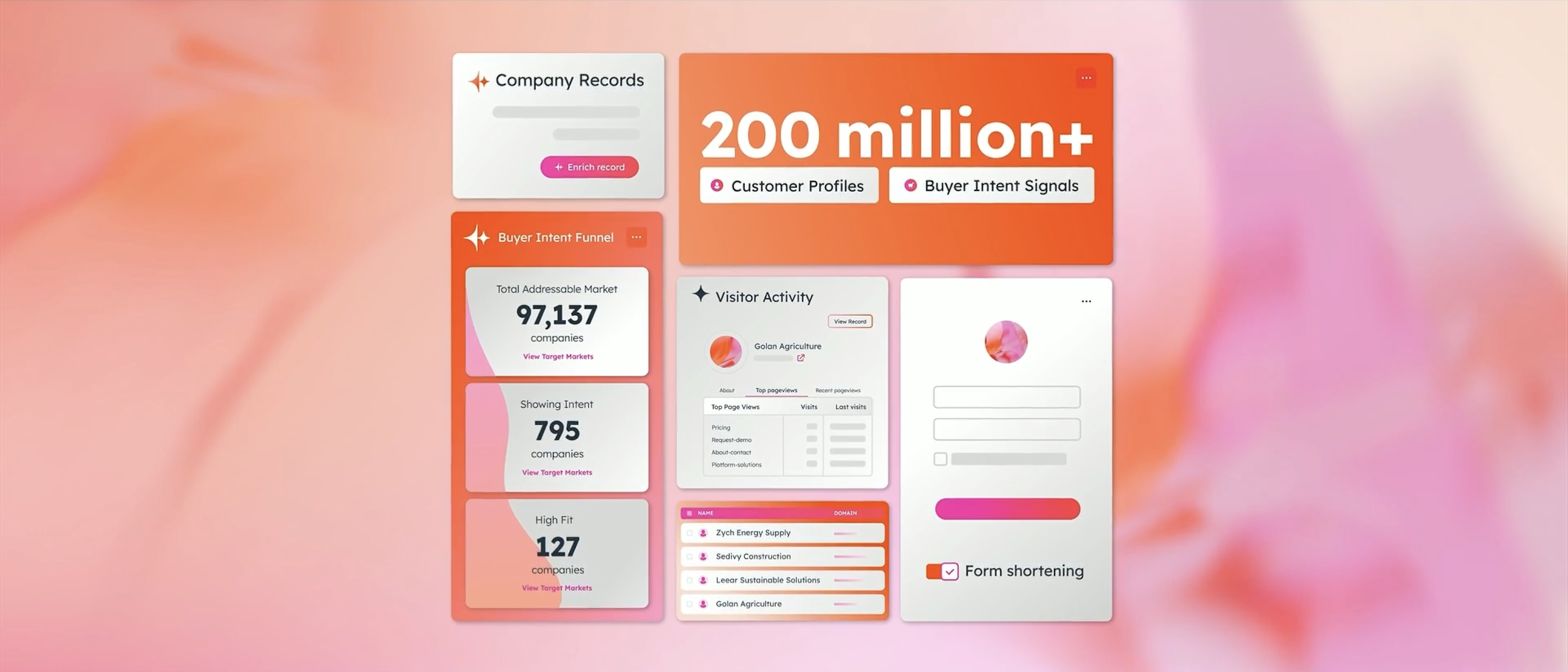
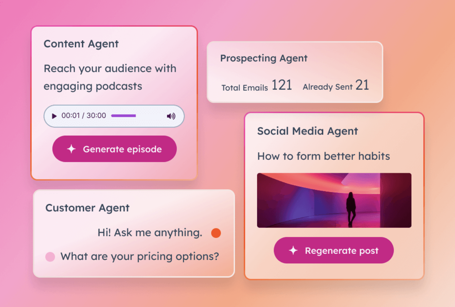
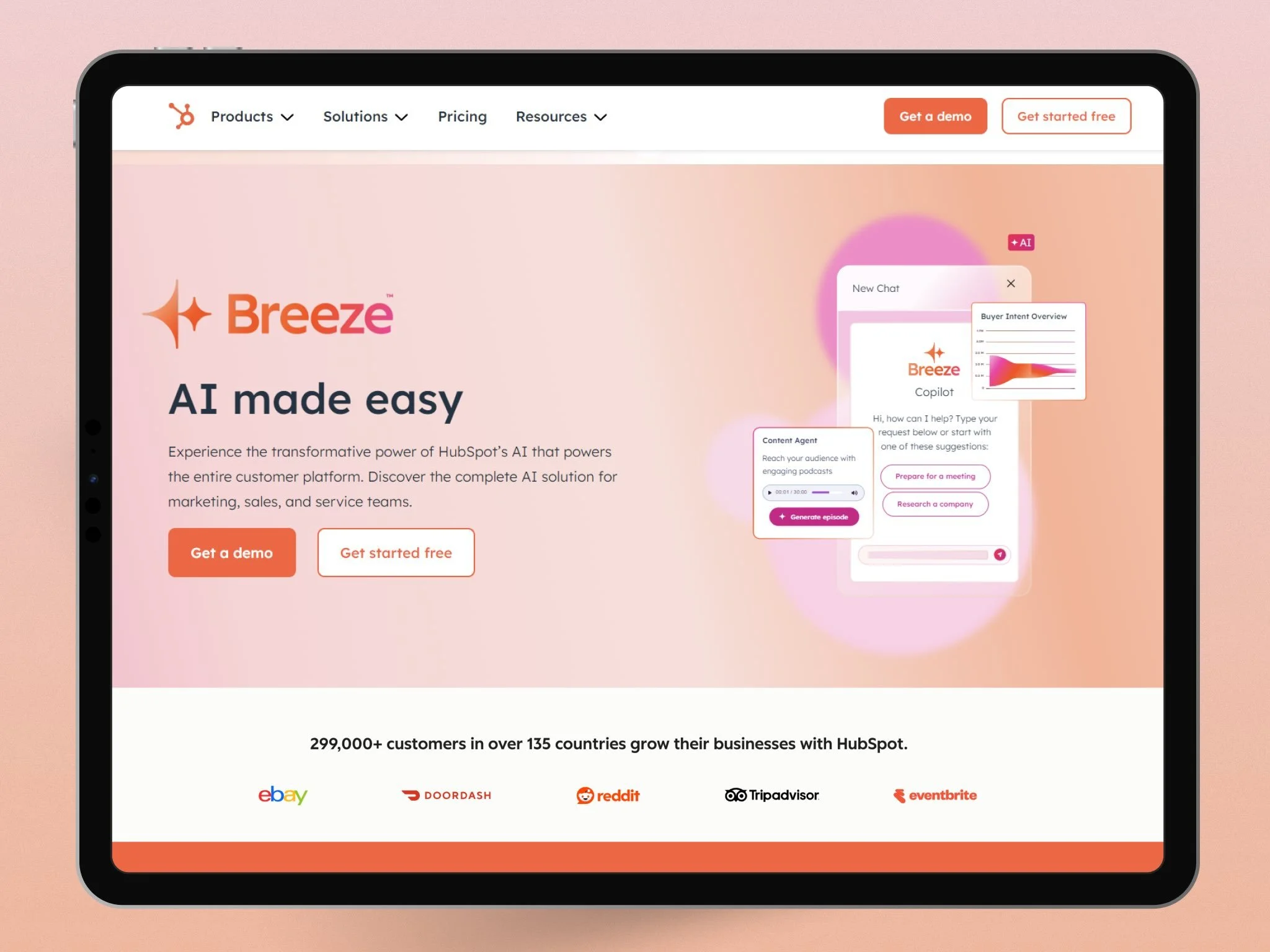
During initial customer discovery for HubSpot’s flagship AI agent ecosystem, Breeze, we uncovered a massive psychological barrier. Everyday business users overwhelmingly felt that artificial intelligence was not for them, viewing it as an intimidating developer tool. While an external agency developed the baseline visual identity for Breeze, my mandate as creative director was to take that initial scaffolding and figure out how to make it scale seamlessly for our premier global event, INBOUND. Instead of defaulting to the tech industry's standard dark-mode, neon-circuit aesthetic, I directed the team to double down on an approach that felt warm, airy, and human-centric. We leaned heavily into bright backgrounds, HubSpot's signature orange, and a vibrant pink to remove the technical intimidation and frame the ecosystem as a friendly, intuitive workspace companion.
Market Adoption & Launch Success
The strategic bet on making AI accessible paid off immediately across both the tech press and the user base:
Within a week of launch, tens of thousands of users activated the platform. Its parallel developer ecosystem, agent.ai, rocketed to over 47,000 active users and 1,700 agent builders in the initial wave, making it one of the fastest-adopted AI feature sets in B2B history.
Tech publications like SiliconANGLE heavily praised the launch, crediting HubSpot with creating a unified platform that finally made AI easy to use and deeply integrated directly into everyday workflows without complex setups.
As the rollout matured, the user outcomes validated our human-centric positioning. Companies utilizing the platform observed an immediate 40% boost in productivity, with the customer service agent successfully resolving 65% of customer support conversations automatically.
The Scale & Execution
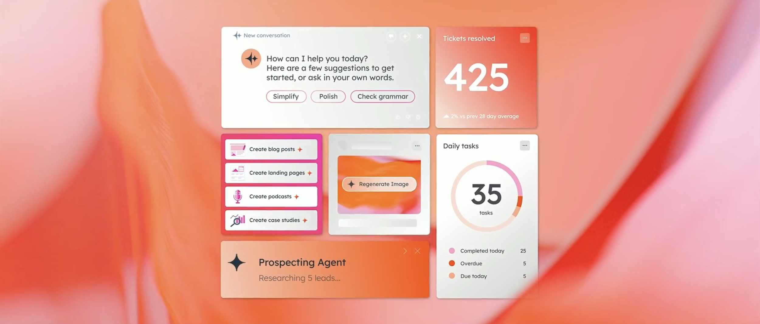
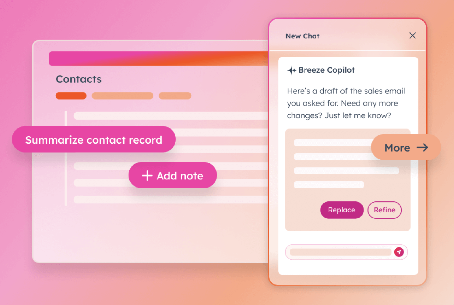
My primary responsibility across the launch was ensuring the product user interfaces came to life on the main stage in a way that felt completely approachable and easy to understand. I led the visual design and creative direction of the software UIs specifically for the keynote presentations. Because the underlying technology handles complex, automated workflows, the interface designs had to strip away the technical noise. I built high-fidelity visual metaphors and intuitive layout structures that allowed product leadership to demonstrate the software effortlessly. By transforming complex data models into clean, clear, and beautiful user experience graphics on the screens, we made the automated agents feel accessible to the average marketer rather than just a software engineer.
Creative rollout beyond the event
INBOUND was just the launchpad. We used that exact visual identity as a blueprint to roll out everything else over the next few months, from a homepage takeover and paid ads to our social channels. It kept the whole product launch feeling like one cohesive story, no matter where a customer ran into it.